The Rewards.de app is a platform that allows users to earn money by engaging in various online activities such as testing games, apps, and websites, completing surveys, and shopping online to receive cashback. Users accumulate points through these activities, which can be redeemed for real rewards like PayPal cash or gift cards.
Time frame: 1 year - Freelancer // My role: Lead Product Designer
Key Goals and Objectives
⭐️ Simplify the user experience around earning and redeeming rewards.
⭐️ Build visual trust through clean, accessible, and modern UI.
⭐️ Reduce friction in onboarding and core actions.
⭐️ Encourage repeat usage with a friendly, intuitive, and motivating interface.
⭐️ Create a flexible design system for future product evolution and multi-platform consistency.
Challenges
Overloaded interface:
The original UI was cluttered and text-heavy, making it hard to navigate.
Low retention:
Users dropped off during onboarding or after completing a few tasks.
Inconsistent visuals:
Colors, typography, and component styles varied across screens.
Trust barrier:
Users were skeptical of rewards apps; the design needed to reinforce credibility.
Scalability:
The team lacked a structured design system, making updates slow and inconsistent.
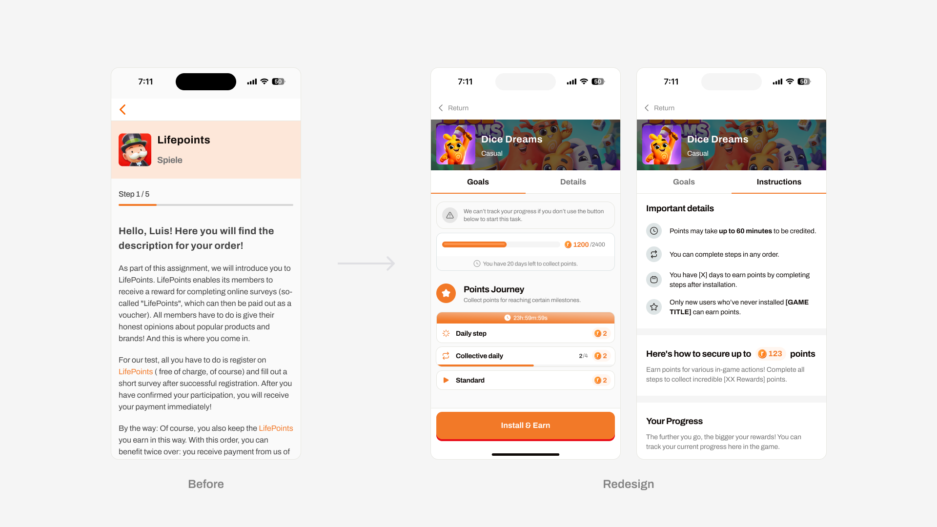
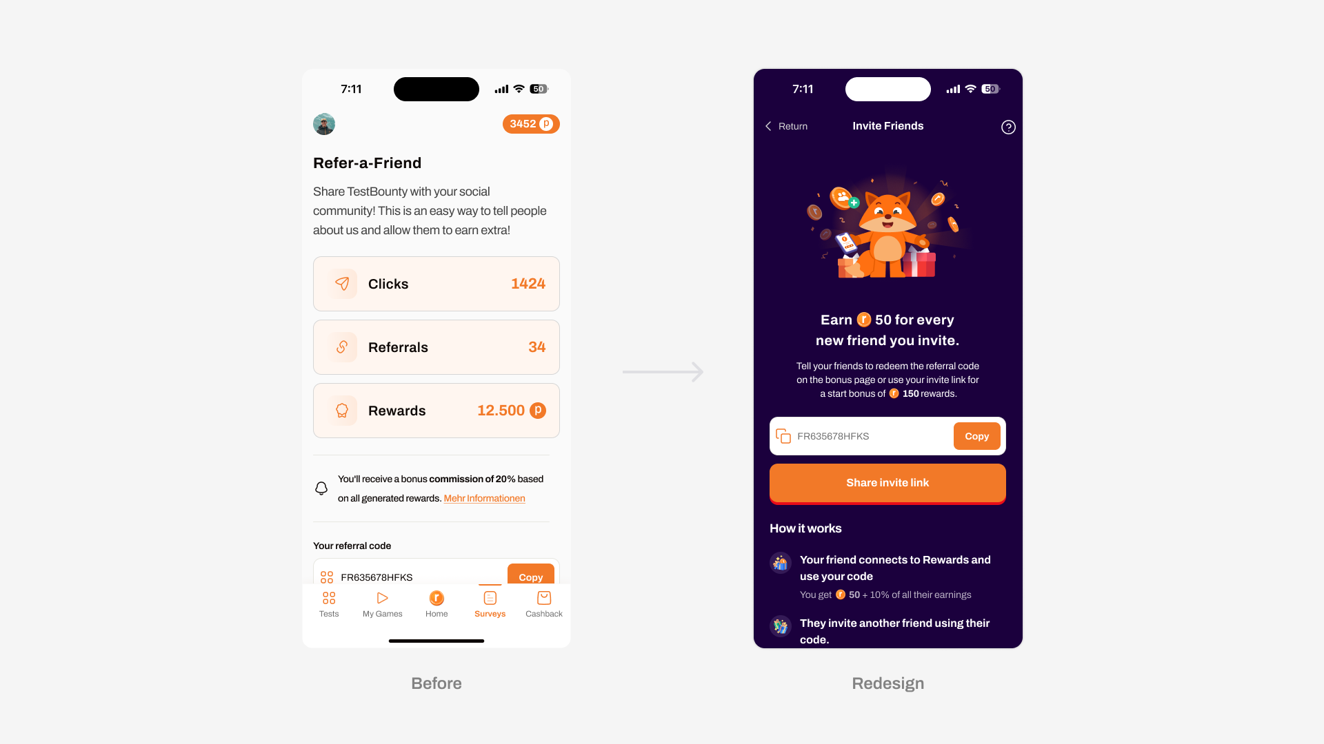
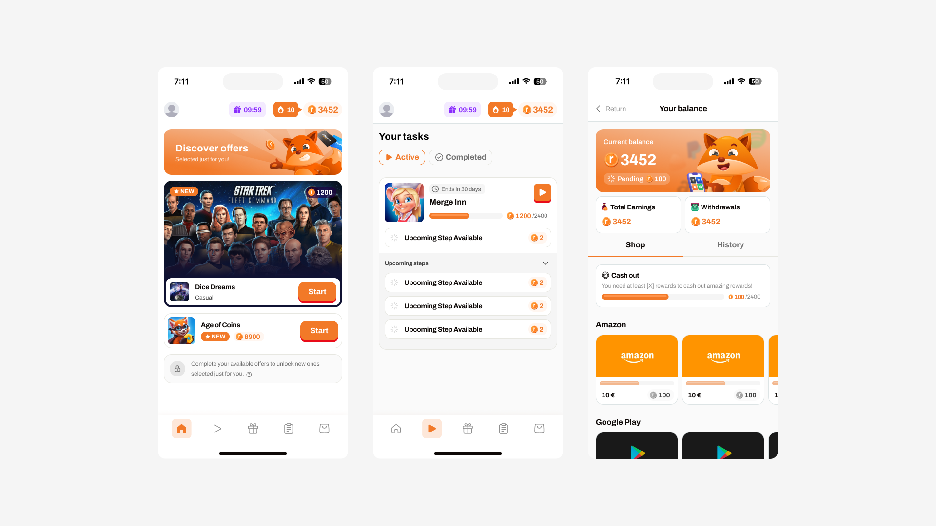
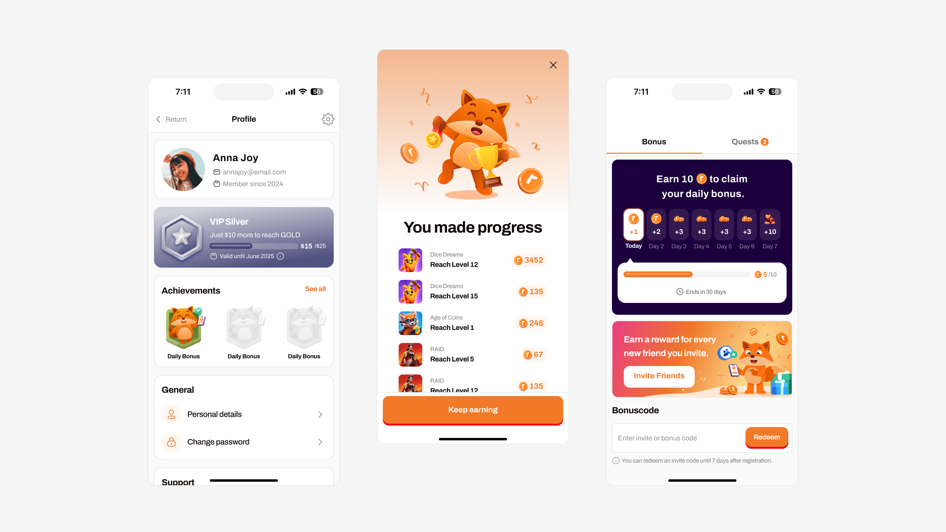
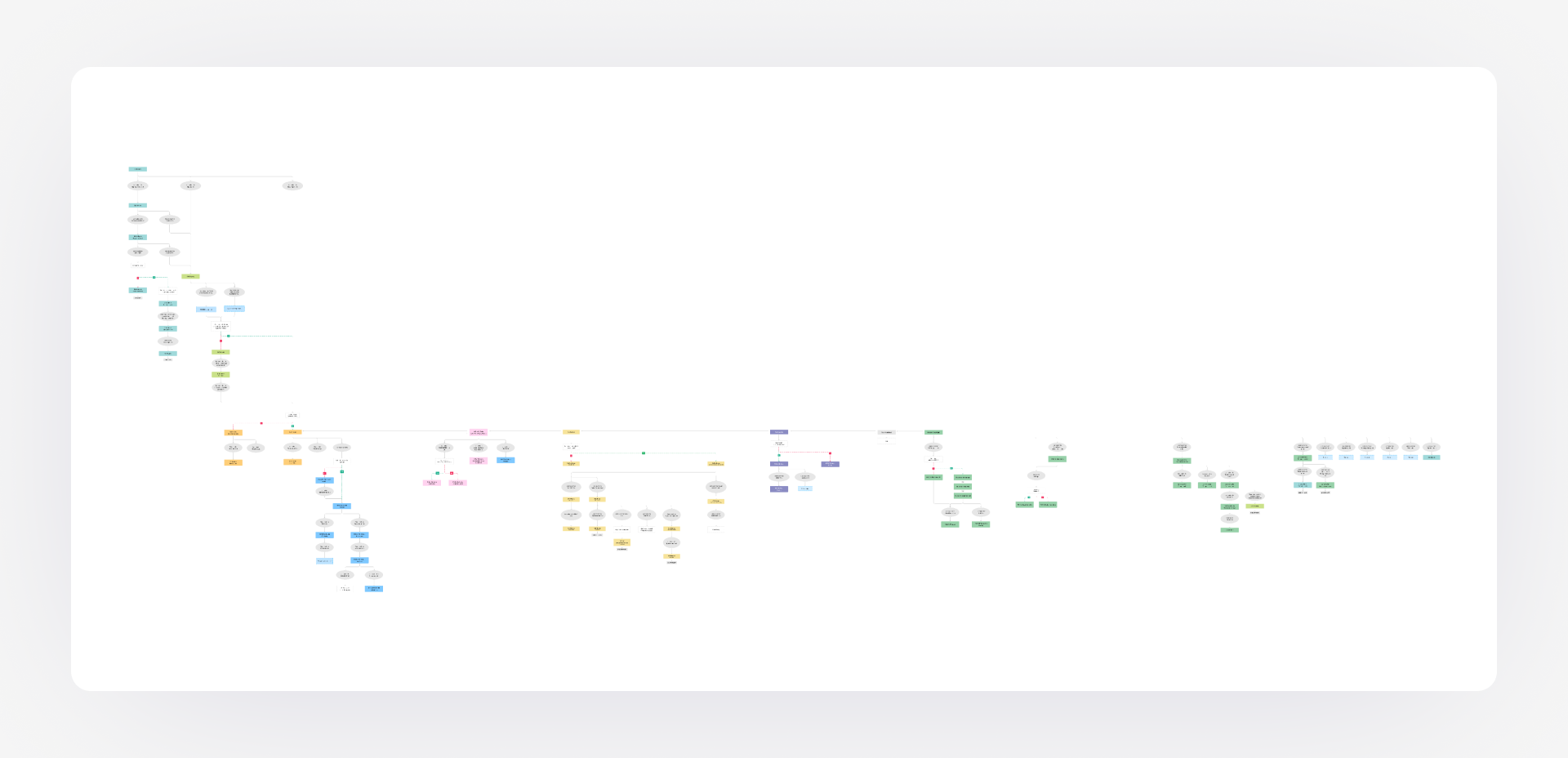
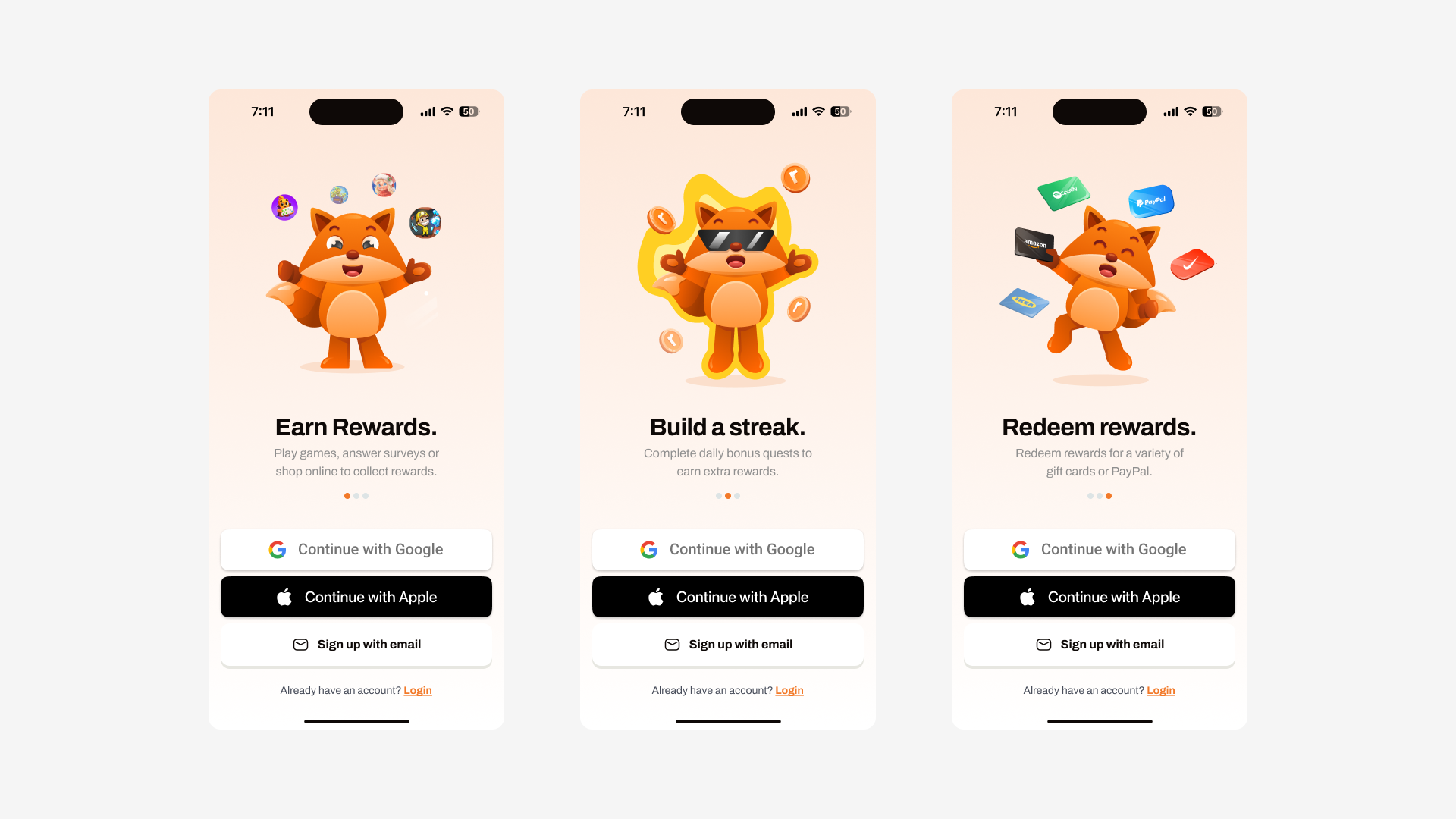
User flow
Introduced a step-by-step flow to clarify what Rewards.de is and how it works.
Task Discovery:
Designed a categorized, filterable pages for surveys, games, and cashback tasks.
Reward Tracking:
Introduced a progress system and clear status indicators for each task.
Cash out:
Streamlined the process of selecting a reward and confirming a payout method.
Account Management:
Created a simplified profile and wallet area with clear data access and privacy controls.
I used flowcharts, wireframes, and interactive prototypes to iterate quickly with stakeholders and users.
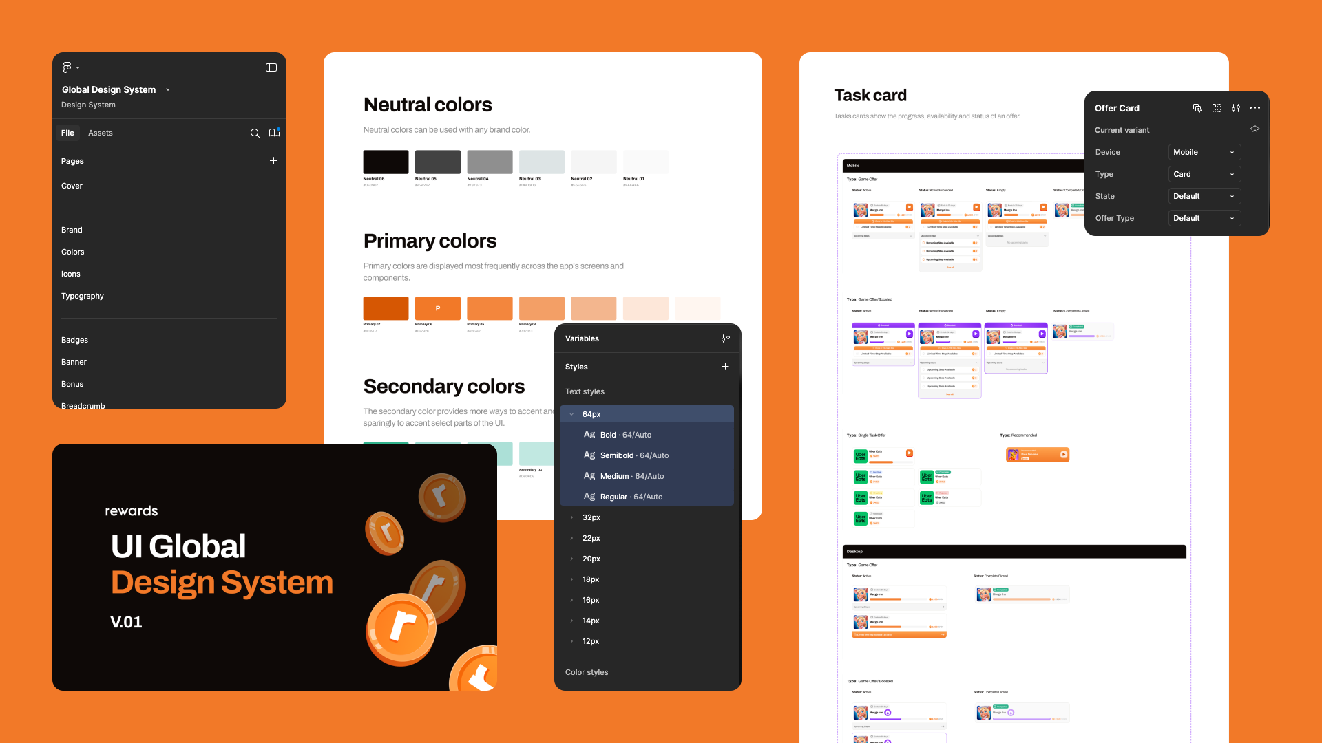
Design System: Creation & Expansion
To future-proof the product, I've established a robust design system that included:
Component Library:
Modular UI elements (buttons, cards, inputs) in Figma with responsive variants.
Tokens:
A scalable system for spacing, typography, and colors, ensuring consistency and speed across platforms.
Documentation:
Clear usage guidelines, states, and accessibility notes for every component.
Developer Handoff:
Seamless collaboration via Figma’s inspect tools and shared library, ensuring pixel-perfect implementation.
Ongoing Iteration:
The system was designed to be flexible for future features like referral systems, seasonal events, and personalized tasks.
Conclusion
Increased activation rate: First-task completion rate rose significantly after onboarding redesign.
User feedback highlighted the interface as a reason for continuing use.
Reduced support tickets: Thanks to clear, visually guided flows for redemption and task navigation.
User feedback highlighted the interface as a reason for continuing use.
Reduced support tickets: Thanks to clear, visually guided flows for redemption and task navigation.