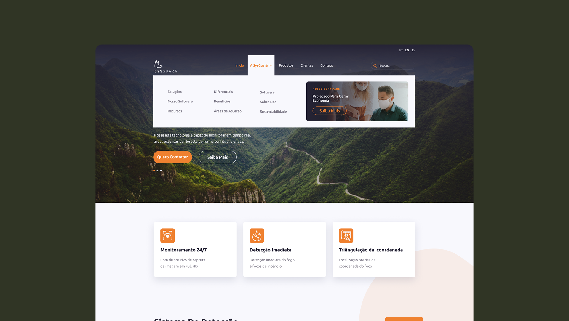
Overview
SysGuará is a Brazilian SaaS platform designed to help rural landowners, agronomists, and security teams monitor and respond to wildfire threats in real time. The product combines GPS-mapped field points, PTZ camera feeds, and configurable alarm systems into a single web-based dashboard.
This case study covers the UI redesign of the platform's core modules: the interactive map view, the camera monitoring system, and the supporting design system that ties the product together.
This case study covers the UI redesign of the platform's core modules: the interactive map view, the camera monitoring system, and the supporting design system that ties the product together.
My role: Product Designer | Time frame: 3 months
What needs are we looking to solve?
The platform had a functional but visually inconsistent interface that lacked a coherent design language. Components were not systematized, making the product difficult to scale and maintain. The goal of this redesign was to establish a cohesive visual identity, improve information hierarchy across key workflows, and create a design system that the development team could confidently build upon.
User Flows & Information Architecture
The application follows a straightforward navigational structure, moving from authentication into a central dashboard with seven key modules: Map, Off-Grid Equipment, Cameras, Occurrences, Reports, Settings, and Users.
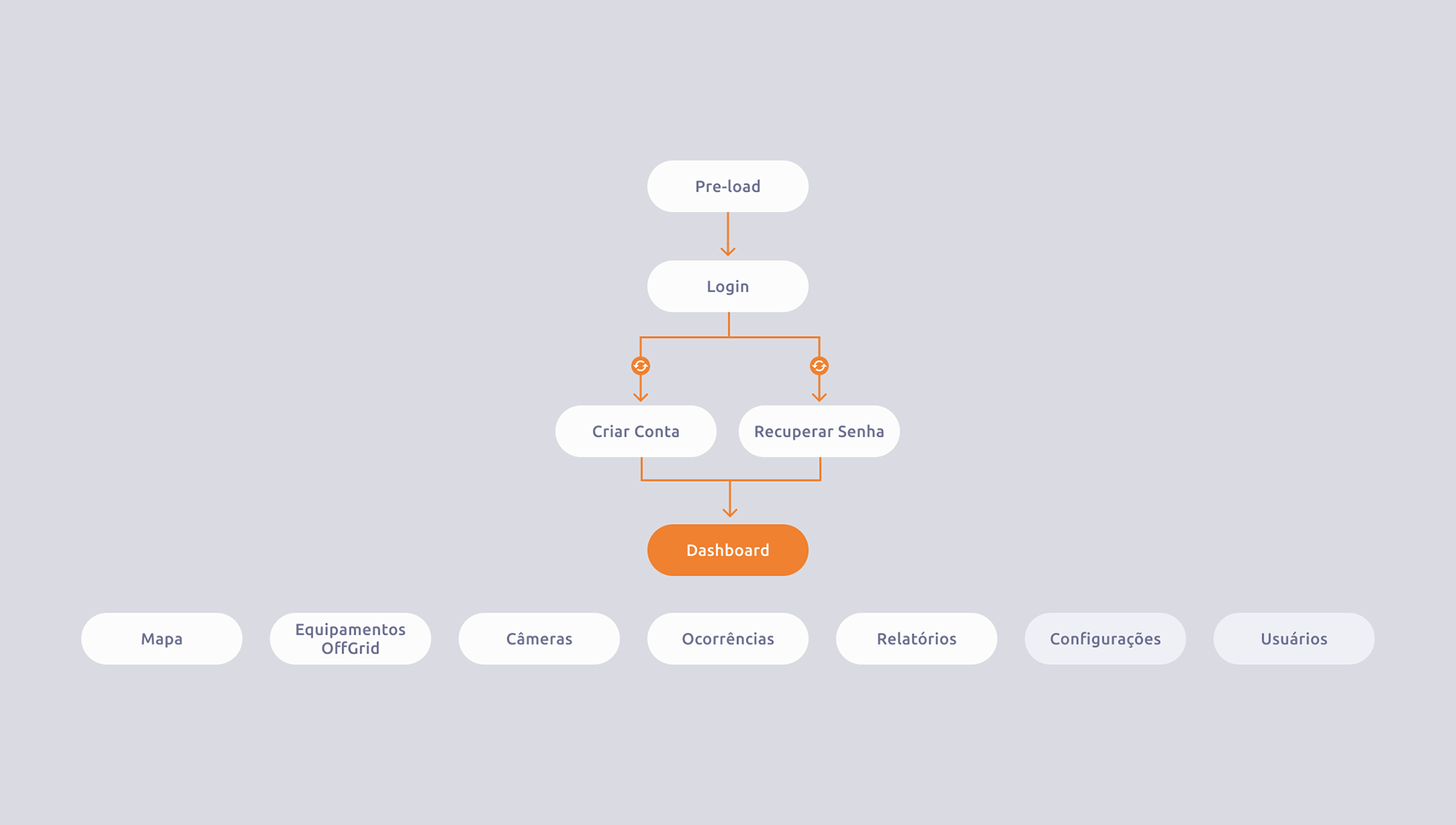
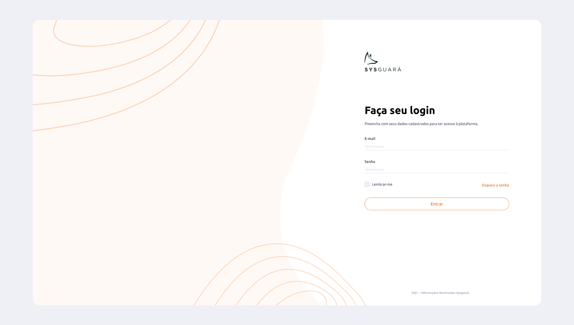
Authentication flow
The entry point begins with a pre-load screen that transitions into the Login page. From there, users can branch to account creation or password recovery before reaching the main dashboard. The flow is intentionally linear and low-friction, as operators may need to access the platform quickly under time-sensitive conditions.
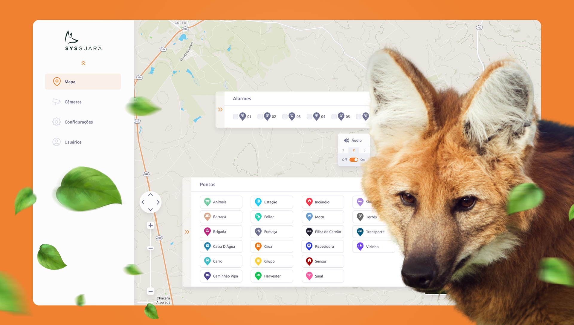
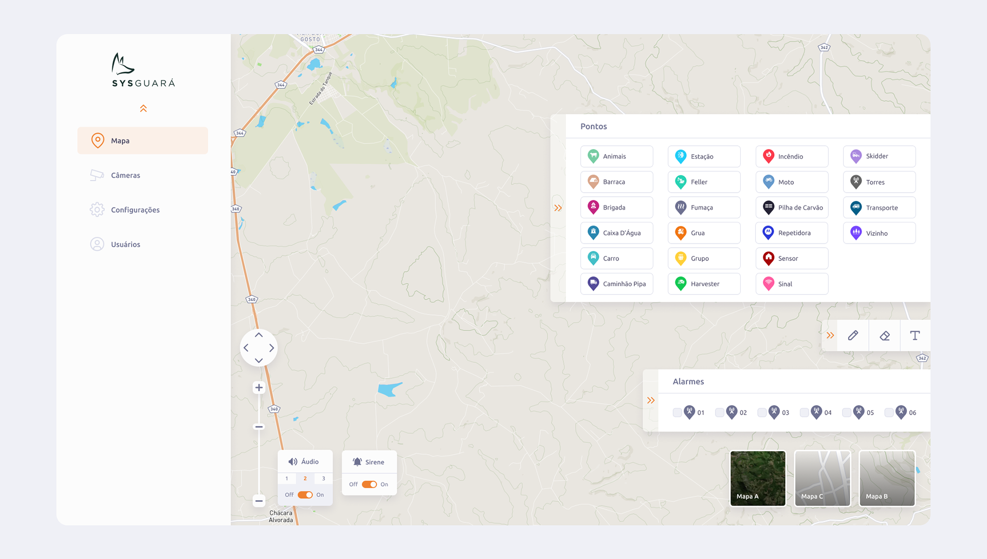
Map module
The map is the operational core of the product. Users interact with a full-screen geographic view layered with configurable point markers — spanning 20 asset types including animal sightings, fire detection sensors, watchtowers, vehicles, and crew positions. Overlaid panels allow operators to manage alarm zones, toggle audio and siren alerts, and switch between different map styles (Mapa A, B, and C). A collapsible toolbar on the right edge provides drawing and annotation tools for adding contextual information directly to the map. The alarm strip at the bottom of the map panel gives quick access to numbered alarm points, each with an independent toggle.
The map is the operational core of the product. Users interact with a full-screen geographic view layered with configurable point markers — spanning 20 asset types including animal sightings, fire detection sensors, watchtowers, vehicles, and crew positions. Overlaid panels allow operators to manage alarm zones, toggle audio and siren alerts, and switch between different map styles (Mapa A, B, and C). A collapsible toolbar on the right edge provides drawing and annotation tools for adding contextual information directly to the map. The alarm strip at the bottom of the map panel gives quick access to numbered alarm points, each with an independent toggle.
Cameras module
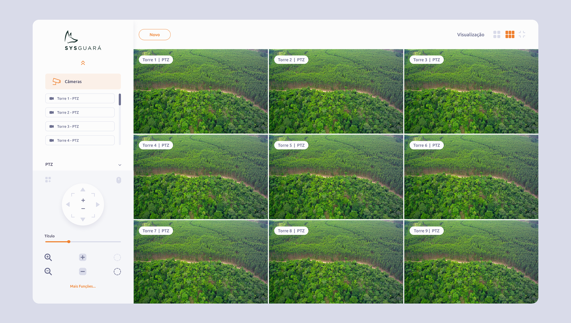
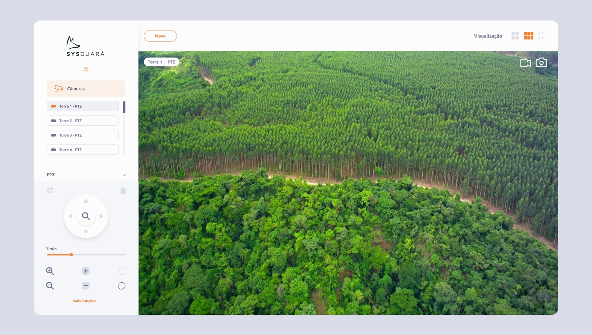
The camera view presents live PTZ feeds from multiple watchtowers in a responsive grid layout. Users can switch between list and grid visualization modes, select individual camera feeds from the sidebar, and control camera direction and zoom through an on-screen PTZ joystick interface. A title slider and additional function controls give operators fine-grained control over each feed without leaving the view.
The camera view presents live PTZ feeds from multiple watchtowers in a responsive grid layout. Users can switch between list and grid visualization modes, select individual camera feeds from the sidebar, and control camera direction and zoom through an on-screen PTZ joystick interface. A title slider and additional function controls give operators fine-grained control over each feed without leaving the view.
Visual Identity
The design system was built around two core brand values: environmental awareness and operational reliability. These informed every decision from color selection to component behavior.
The design system was built around two core brand values: environmental awareness and operational reliability. These informed every decision from color selection to component behavior.
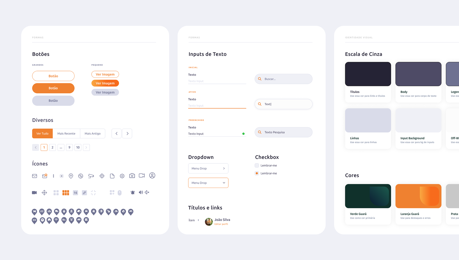
Design Decisions
Floating overlay panels over full-screen takeovers. Rather than routing users away from the map to manage alarms or points, all controls are surfaced as floating panels directly on the map canvas. This keeps the geographic context always visible, which is critical when responding to a fire event.
Collapsible panel architecture. Both the Pontos panel and the Alarmes strip use expand/collapse arrows, allowing operators to reclaim screen real estate on smaller displays or when full map visibility is prioritized.
Grid-first camera layout. The default camera view shows a 3×3 grid of live feeds, giving operators a broad situational overview before drilling into a specific tower. The sidebar list provides a secondary navigation layer for individual feed selection, while the visualization toggle lets users switch to a single-feed or alternate grid configuration.
Orange as a functional signal. Orange is not used decoratively. Every instance in the interface carries meaning — active state, selected item, alert, or primary action. This restraint ensures the color retains its attention value and operators are not desensitized to it.
Outcome
The redesign produced a unified design system that serves as a shared language between design and development. Core modules — Map and Cameras — were redesigned with clear information hierarchies, consistent component patterns, and an interaction model suited to time-sensitive operational contexts. The visual identity connects the product to its ecological mission without compromising the functional clarity expected of a monitoring tool.
The redesign produced a unified design system that serves as a shared language between design and development. Core modules — Map and Cameras — were redesigned with clear information hierarchies, consistent component patterns, and an interaction model suited to time-sensitive operational contexts. The visual identity connects the product to its ecological mission without compromising the functional clarity expected of a monitoring tool.