Product Designer ✦ 10 months ✦ Design Systems ✦ Shipped
The Product
Pushed aims to create the easiest path to earning income from content for new content creators and aspiring creators who struggle to monetize early, feel overwhelmed by existing affiliate tools, and often abandon content creation before seeing results, by providing a simple, creator-first affiliate platform that accelerates first earnings, increases creator retention, and builds long-term monetization habits.
Pushed aims to create the easiest path to earning income from content for new content creators and aspiring creators who struggle to monetize early, feel overwhelmed by existing affiliate tools, and often abandon content creation before seeing results, by providing a simple, creator-first affiliate platform that accelerates first earnings, increases creator retention, and builds long-term monetization habits.
Details
Surface
Mobile (Android and iOS)
Founding Product Designer
Lead Product Designer (freelancer contributor)
Team members
CEO, Product Manager, Front-end Dev
Scope
UX/UI, Design System (Scaling and improving MVP usability)
Surface
Mobile (Android and iOS)
Founding Product Designer
Lead Product Designer (freelancer contributor)
Team members
CEO, Product Manager, Front-end Dev
Scope
UX/UI, Design System (Scaling and improving MVP usability)
Problem
New and aspiring content creators want to monetize their content early, but existing affiliate and creator monetization tools are overly complex, fragmented, and designed for experienced influencers. As a result, beginners feel overwhelmed, struggle to see early results, and often abandon content creation before earning their first income.
Solution
Design a simple, creator-first affiliate platform that helps beginners start earning from content quickly through guided onboarding, one-click affiliate tools, AI-assisted product recommendations, educational monetization support, and motivating progress systems that make monetization feel achievable from day one.
100%
Workflow improvement
by handoff documentation and design system implementation
Workflow improvement
by handoff documentation and design system implementation
2k+
Active new users
validation of a cleaner positioning
Active new users
validation of a cleaner positioning
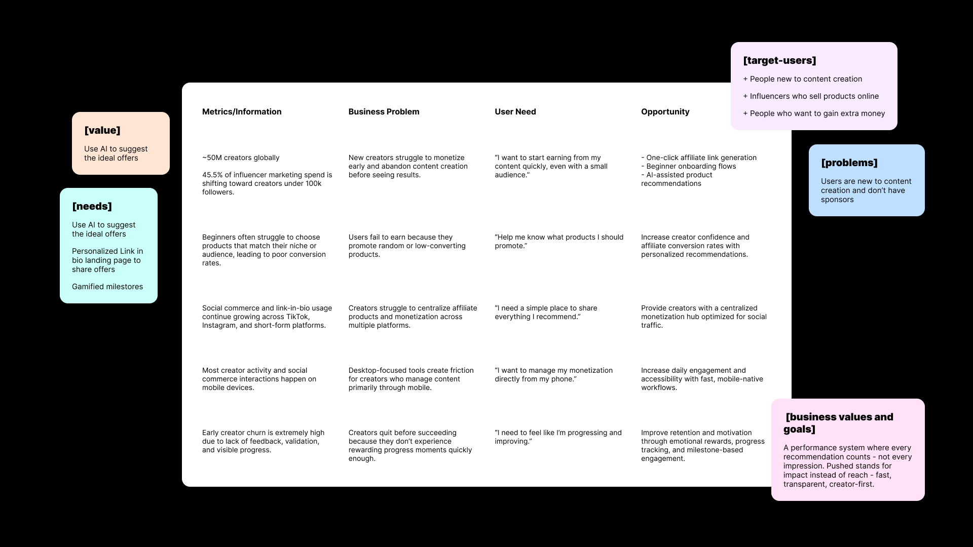
Process + Key insights
I conducted a market & benchmarking research to understand
the new content creator main needs and track opportunities.
the new content creator main needs and track opportunities.
- 45.5% of influencer marketing spend is shifting toward creators under 100k followers.
- Beginners often struggle to choose products that match their niche or audience, leading to poor conversion rates.
- Most creator activity and social commerce interactions happen on mobile devices.
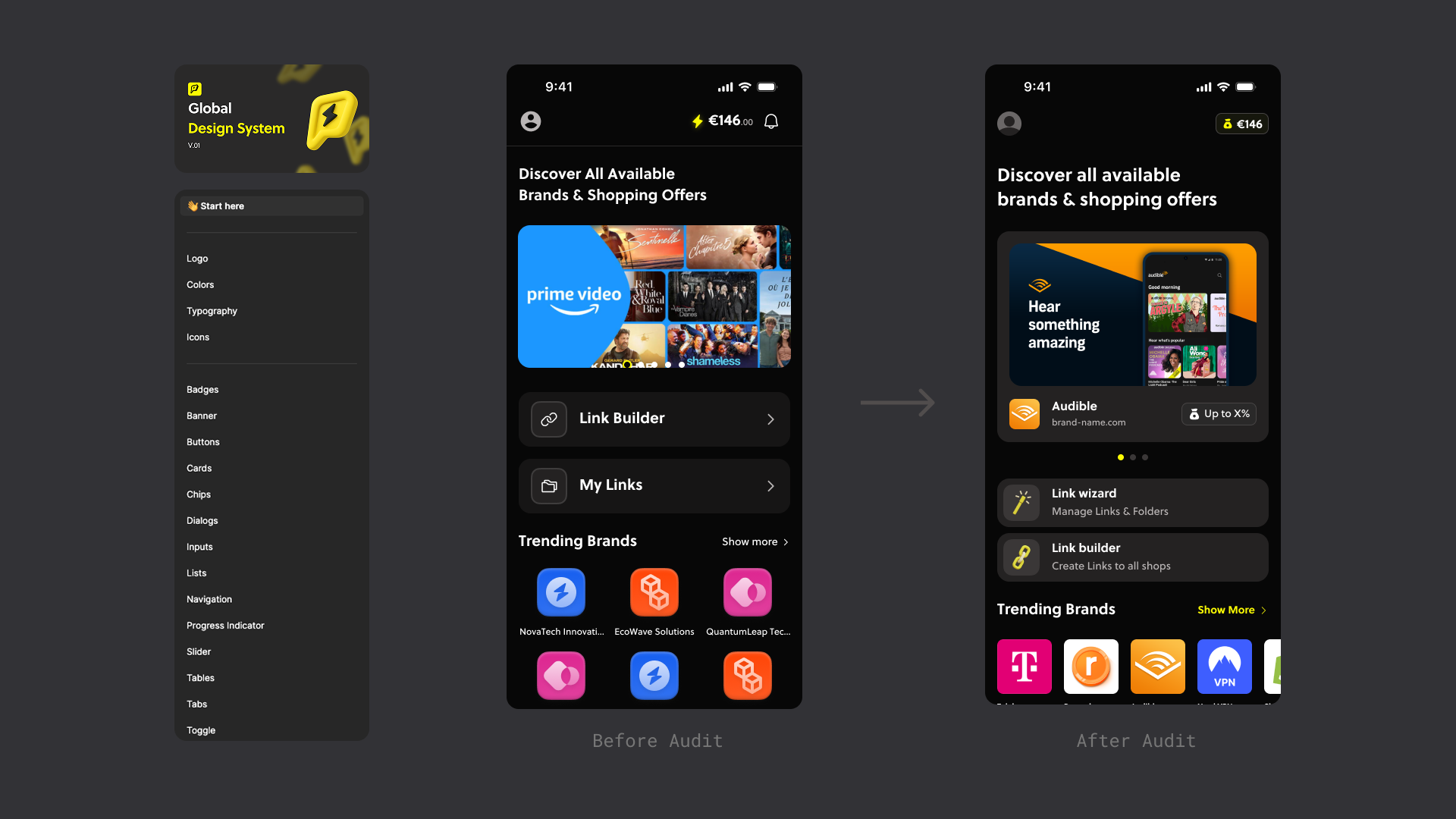
Legacy Design System Audit
The MVP lacked hierarchy and consistency by not following any grids or patterns, resulting in busy visuals making it difficult for users to understand navigation or even trust the brand.
Audited the design system and defined robust documentation, tokens, standardized core components and patterns for consistent spacing, use of fonts, colors and copy.
Audited the design system and defined robust documentation, tokens, standardized core components and patterns for consistent spacing, use of fonts, colors and copy.
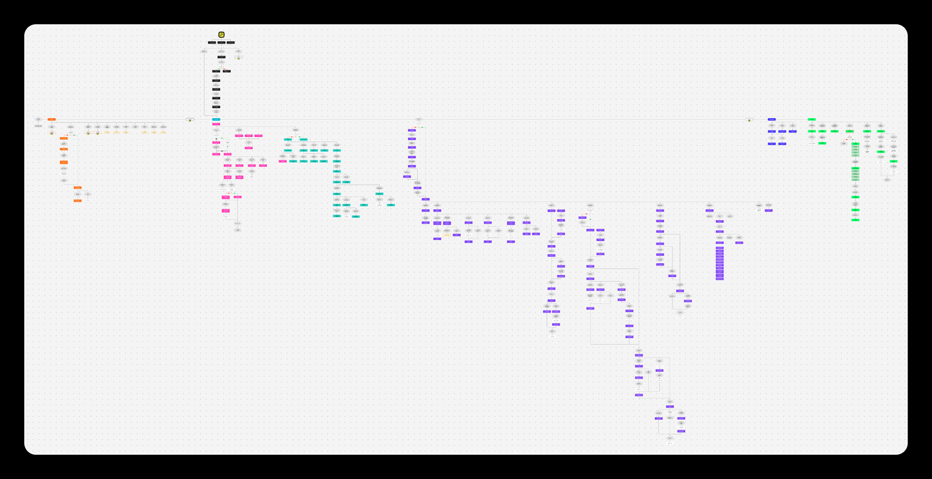
Documenting the user journey
Identifying dead ends and friction points affecting the usability.
I started by labeling each screen with an exclusive number and title dividing them into sections then listing all of them at Figjam where each section had a color attributed to it. I mapped the entire user flow from app launching, onboarding, profile modifications, building, saving and editing links, pages and folders.
Design 01
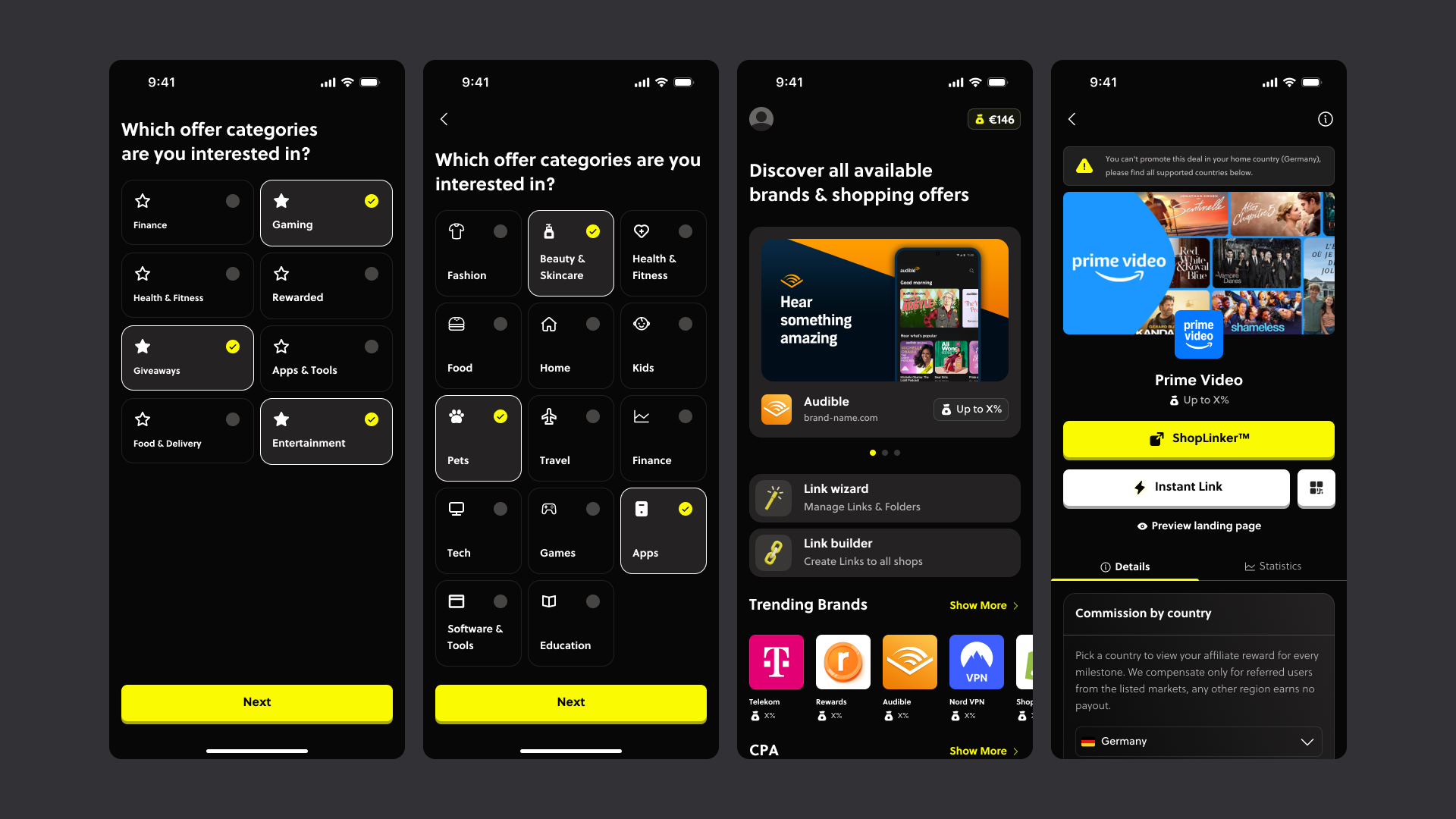
New creators want to start earning from content quickly, even with a small audience.
The onboarding flow was designed to reduce friction and make monetization feel immediately achievable. Users provide a few key details about their niche, audience, and content goals, allowing the platform’s AI to personalize affiliate recommendations from the start. The experience focuses on simplicity and clarity, enabling creators to generate and share affiliate links within minutes through an intuitive, beginner-friendly interface.
The onboarding flow was designed to reduce friction and make monetization feel immediately achievable. Users provide a few key details about their niche, audience, and content goals, allowing the platform’s AI to personalize affiliate recommendations from the start. The experience focuses on simplicity and clarity, enabling creators to generate and share affiliate links within minutes through an intuitive, beginner-friendly interface.
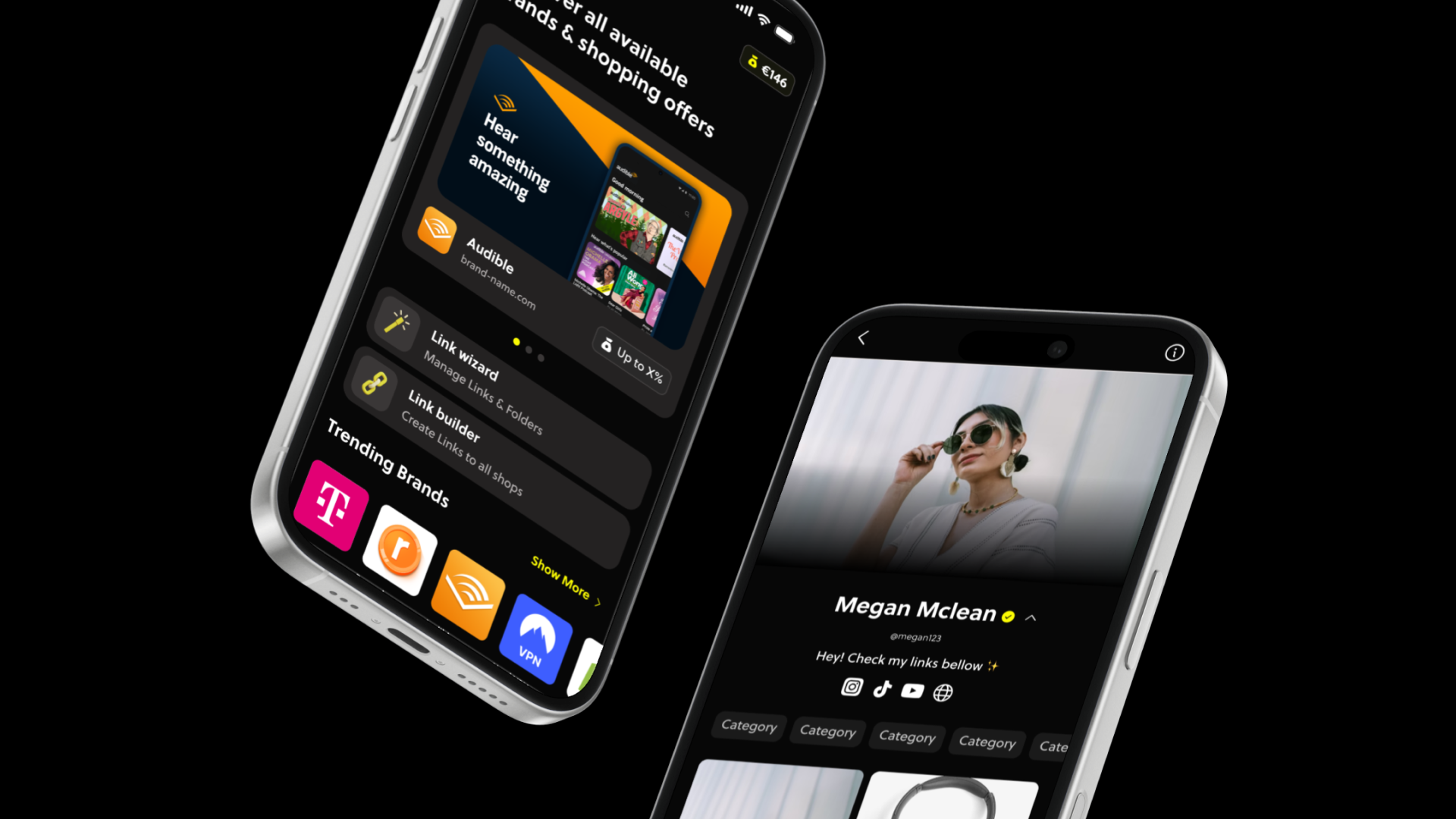
Design 02
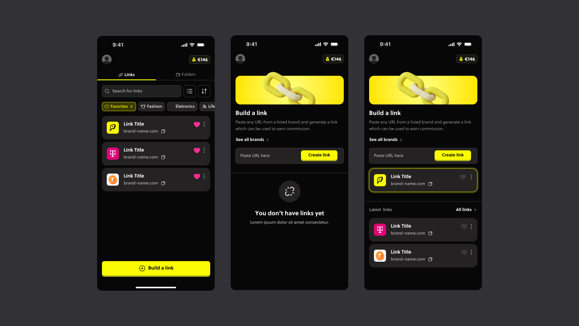
Link Builder: An experience designed to make monetization fast and effortless, reducing technical friction and helping users start earning commission with minimal setup.
Creators can paste any product URL from supported brands to instantly generate an affiliate link ready to share across social platforms.
Design 03
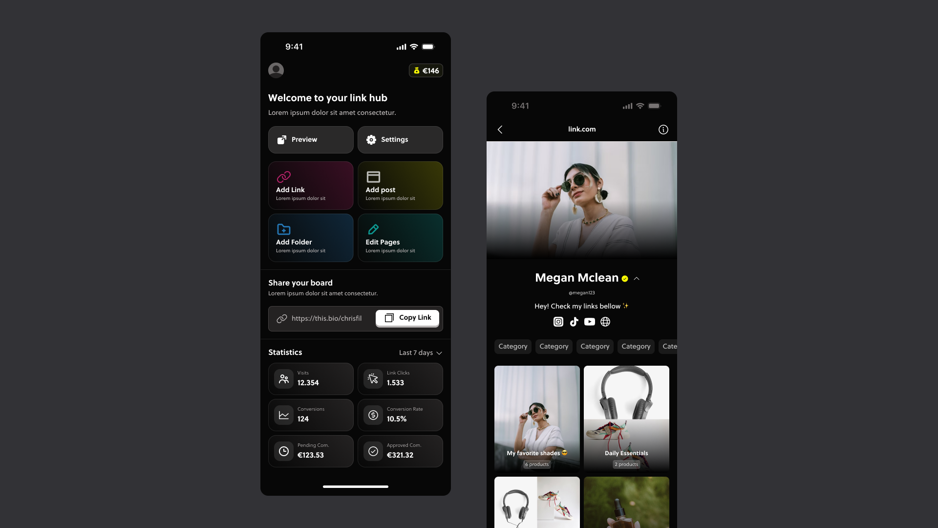
Creators need a simple place to share everything they recommend.
To design this experience, I researched link-in-bio products such as Linktree and analyzed how creators navigate between content, affiliate links, and storefront-style pages. From these insights, I mapped the ideal user journey and integrated it into the platform’s existing monetization flow.
Using wireframes, I defined the core structure, navigation, and interaction patterns for the feature, resulting in more than 50 screens covering the complete experience, from link-in-bio onboarding and page setup to profile customization and affiliate showcase management.
Design 03
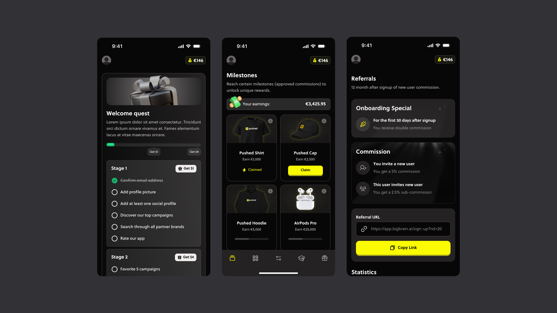
Users need to feel like they are progressing and improving.
Early-stage creators often lose motivation when growth and earnings feel slow or invisible. To improve engagement and retention, I designed gamification features focused on rewarding progress and reinforcing monetization habits.
The system included onboarding bonuses, referral rewards, and creator profile tiers based on earnings and activity. These mechanics helped make small milestones feel meaningful, encouraging users to stay active and motivated from day one.
Conclusion
Successfully improved the product positioning by creating a reliable and comprehensive experience beyond visuals by closely collaborating with stakeholders and developers.
Thank you for reading 💜